02 Feb 2017: The Year of Going Back to the Drawing Board
As 2017 drew to a close, digital marketers everywhere scrambled to assemble meaningful posts reflecting on the year that was. We simultaneously searched the web for stories, quotes and quips that struck the balance between sentimentality and seriousness, fondness and forward thinking and humour and honesty.
One quote that can’t have escaped your attention is this gem:
Having done more rounds than Mohammed Ali, this phrase, with it’s vast array of ‘inspirational’ backdrops (for nothing says sincere reflection like long and winding roads) is favoured by social media managers and Instagram aficionados alike. Love it or loath it, the cheery message invites you to step back and appreciate your progress.
However, the act of looking backwards can be a valuable learning exercise for businesses stuck in a bit of a brand rut. Beginning in ’16 and running right throughout ’17, the past year or so has seen numerous businesses open up the vaults and dust off their design guides of yore. We’ve seen organisations unveil logo rebrands that take them back to their roots or, at least, back to a time where their performance and public respect and engagement was at its peak. We take a look at some big businesses who have demonstrated more than a nod to nostalgia in 2017.
Natwest
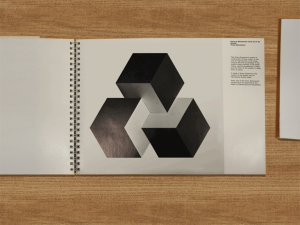
2016 saw Natwest take a leap back in time when it came to design. The bank’s logo, three intertwined cubes designed to represent the joining of three separate banks, has never strayed too far from their original roots. Inspired by the original 1968 brand guidelines, the 2016 logo replaced the arrowhead structure of the 2014 design with firm cubic outlines.
The positioning of red against purple gives the logo an almost duotone feel: an effect that grew in popularity throughout 2017 and is not set to fall out of favour in the new year. With banks hardly being held in the highest esteem by the public over recent years, Natwest’s design relaunch saw them attempt to return to both their roots and a time where banks were trusted institutions
WHSmith
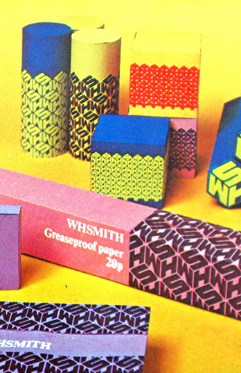
2017 saw high street stalwart, W.H. Smith celebrate their 225th anniversary. To celebrate this milestone, the design team brought back their well-loved cube logo. The orange and brown cube was the celebrated design child of influential designer, Professor Richard (Dick) Guyatt and his crack team of design specialists: Ian Middleton, Jane-Ann Withers and Nick Jenkins. The Times Bold typeface and iconic, “très” 70s, orange and brown colour way went on to feature across touchpoints, from wrapping paper and bags to lories and fascias. Although the company haven’t reverted back to their iconic logo, they have released a series of canvas and plastic bags adorned with the design in celebration of their milestone birthday. With increasing numbers of iconic High Street brands disappearing from sight over recent years, W.H. Smith’s decision to dust off their logo indicates to shoppers that they have been and will continue to be a key figure on our high streets for many decades to come.
The act of looking back can help Brands plan for their future. If your business is looking for a rebrand, why not take a look back into your history- you might be pleasantly surprised by what you find. Here at WDC we offer both new and refresher branding services. Get in touch with us to have a chat and see how we can help bring your organisation up to date 🙂


