Website
Industry
International sourcing and logistics
Category
Branding, Digital Design, Print DesignAbout This Project
GHL Sourcing
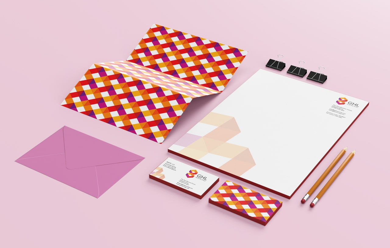
Approached us to design their entire brand strategy. GHL Sourcing source goods from Asia from an extensive range of factories for their clients. They needed a brand identity that established them as a global market presence. Our concept was based around visually depicting a symbiotic relationship. We conducted research and came up with an infinity loop/ figure of eight design (which is also a lucky number in Asia) design. The colour palette was chosen to reflect the vibrancy of the Asian market with with the red hues being a nod to Asia’s association of the colour with luck.
Their identity was brought up to date by developing a geometric version of the loop/figure of eight. The design also could read as two boxes being exchanged between Asia and Britain -reflecting GHL Sourcing’s business model. Gill Sans was chosen as the typeface as it is easy to read: an important consideration given the nature of the business and how a large percentage of their target audience are not native English speakers.
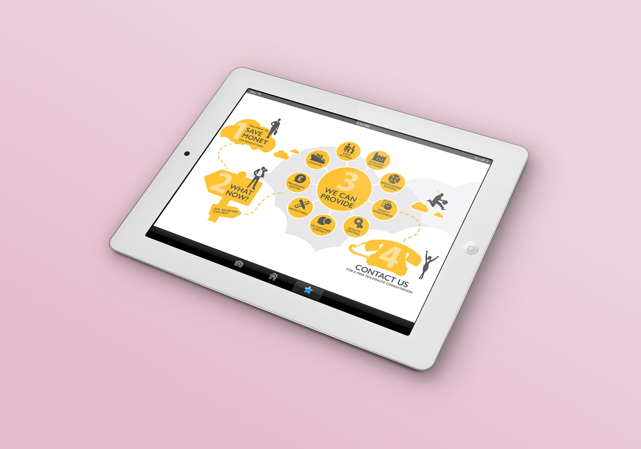
We employed their branding to all their corporate communications. This ensured a synergy across all media and created a sense of professionalism across all contact points. We also created an infographic to simply explain the companies processes to prospective clients.